使用 shadcn/ui 前該補的 TailwindCSS 基礎知識(四) - 透過 @theme 自訂設計系統
· 閱讀時間約 6 分鐘
本文是「使用 shadcn/ui 前該補的 TailwindCSS 基礎知識」系列文章的第四篇
系列文章:
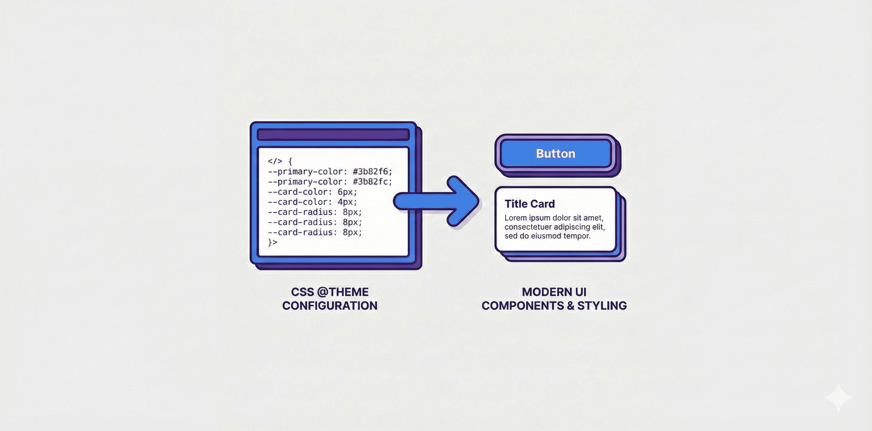
在上一篇中,我們學習了 TailwindCSS 內建的 utility classes。但在實際專案中,你可能會需要:
- 定義品牌專屬的顏色(如
primary、secondary) - 統一管理設計 token(如圓角大小、字型)
- 建立可主題化的設計系統
這就是 @theme 的用途。
@theme 的核心概念
@theme 是 TailwindCSS v4 的新功能,讓你可以在 CSS 中定義設計 token,TailwindCSS 會自動將這些 token 轉換成對應的 utility classes。
命名空間規則
這是最重要的概念:TailwindCSS 會根據 CSS 變數的前綴 來決定要產生哪些 utility classes。
| CSS 變數前綴 | 產生的 utility classes | 說明 |
|---|---|---|
--color-* | bg-*、text-*、border-*、ring-* 等 | 所有跟顏色相關的屬性 |
--spacing-* | p-*、m-*、gap-*、w-*、h-* 等 | 所有跟間距相關的屬性 |
--radius-* | rounded-* | 圓角 |
--font-family-* | font-* | 字型種類 |
--font-size-* | text-* | 字型大小 |
--font-weight-* | font-* | 字型粗細 |
--line-height-* | leading-* | 行高 |
--letter-spacing-* | tracking-* | 字距 |
--shadow-* | shadow-* | 陰影 |
轉換規則
轉換時會移除「類型前綴」:
--color-primary       → bg-primary, text-primary, border-primary ...
--radius-lg           → rounded-lg
--font-family-heading → font-heading
--spacing-sidebar     → p-sidebar, m-sidebar, w-sidebar ...
顏色系統的客製化
基礎用法
/* index.css */
@theme inline {
  /* 定義顏色 token */
  --color-primary: oklch(0.6171 0.1375 39.0427);
  --color-secondary: oklch(0.9245 0.0138 92.9892);
}
定義後,你就可以在 JSX 中使用:
<button className="bg-primary text-white">主要按鈕</button>
<button className="bg-secondary text-black">次要按鈕</button>
<div className="border-2 border-primary">主色邊框</div>
產生了哪些 utility classes?
定義 --color-primary 後,TailwindCSS 會自動產生:
bg-primary(背景色)text-primary(文字色)border-primary(邊框色)ring-primary(ring 顏色)shadow-primary(陰影顏色)from-primary/to-primary/via-primary(漸層)- ... 以及所有其他需要顏色的 utility classes
Shadcn/ui 的顏色系統
shadcn/ui 使用了一個更進階的模式:將 CSS 變數分成兩層。
/* index.css */
@theme inline {
  /* Layer 1: TailwindCSS 的設計 token(會產生 utility classes) */
  --color-primary: var(--primary);
  --color-primary-foreground: var(--primary-foreground);
  --color-destructive: var(--destructive);
  --color-destructive-foreground: var(--destructive-foreground);
}

:root {
  /* Layer 2: 實際的顏色值 */
  --primary: oklch(0.6171 0.1375 39.0427);
  --primary-foreground: oklch(1 0 0);
  --destructive: oklch(0.5 0.2 30);
  --destructive-foreground: oklch(1 0 0);
}
為什麼要分兩層?
@theme inline中的變數會讓 TailwindCSS 產生 utility classes:root中的變數只是存放實際顏色值- 這樣可以在
.dark中覆蓋顏色值,而不需要重新定義 @theme
使用方式:
// primary 是背景色,primary-foreground 是該背景上的文字色
<button className="bg-primary text-primary-foreground">
  主要按鈕
</button>

// destructive 是警告/刪除用的紅色
<button className="bg-destructive text-destructive-foreground">
  刪除按鈕
</button>
什麼是 foreground?
foreground 是「前景色」,通常指該背景色上的文字顏色。
shadcn/ui 會為每個語意化顏色提供一對顏色:
- 主色(如
primary)→ 作為背景色 - 前景色(如
primary-foreground)→ 作為該背景上的文字顏色
這確保了文字與背景之間有足夠的對比度。
語意化顏色的好處
// ❌ 使用固定顏色:如果要改主題色,要改很多地方
<button className="bg-blue-500 text-white">按鈕</button>
<div className="border-blue-500">邊框</div>
<p className="text-blue-600">文字</p>
// ✅ 使用語意化顏色:只需要改 CSS 變數,所有地方自動更新
<button className="bg-primary text-primary-foreground">按鈕</button>
<div className="border-primary">邊框</div>
<p className="text-primary">��文字</p>
圓角的客製化
定義語意化圓角
/* index.css */
@theme inline {
  --radius-sm: calc(var(--radius) - 4px);
  --radius-md: calc(var(--radius) - 2px);
  --radius-lg: var(--radius);
  --radius-xl: calc(var(--radius) + 4px);
}

:root {
  --radius: 0.5rem;
}
使用方式:
<div className="rounded-sm">較小圓角</div>
<div className="rounded-md">中等圓角</div>
<div className="rounded-lg">標準圓角</div>
<div className="rounded-xl">較大圓角</div>
為什麼用 calc?
使用 calc(var(--radius) - 2px) 的好處是:只要修改 :root 中的 --radius 值,所有圓角大小會等比例調整。
字型的客製化
定義自訂字型
/* index.css */
@theme inline {
  --font-family-sans: "Inter", ui-sans-serif, system-ui, sans-serif;
  --font-family-heading: "Cal Sans", "Inter", sans-serif;
  --font-family-mono: "Fira Code", ui-monospace, monospace;
}
使用方式:
<p className="font-sans">內文使用 Inter</p>
<h1 className="font-heading">標題使用 Cal Sans</h1>
<code className="font-mono">程式碼使用 Fira Code</code>
間距的客製化
定義語意化間距
/* index.css */
@theme inline {
  --spacing-sidebar: 16rem;
  --spacing-header: 4rem;
  --spacing-content: 2rem;
}
使用方式:
<aside className="w-sidebar">側邊欄寬度 16rem</aside>
<header className="h-header">頂部高度 4rem</header>
<main className="p-content">內容區域內距 2rem</main>