使用 shadcn/ui 前該補的 TailwindCSS 基礎知識(五) - 解析 shadcn/ui 的設計系統
本文是「使用 shadcn/ui 前該補的 TailwindCSS 基礎知識」系列文章的第五篇
系列文章:
當你使用 npx shadcn@latest init 初始化 shadcn/ui 專案時,它會自動生成一個 index.css(或 globals.css)檔案。這個檔案乍看之下可能讓人有些困惑:
@import "tailwindcss";

@custom-variant dark (&:is(.dark *));

@theme inline {
  --color-background: var(--background);
  --color-primary: var(--primary);
  /* ... 更多 token */
}

:root {
  --background: white;
  --primary: oklch(0.6171 0.1375 39.0427);
}

.dark {
  --background: #1a1a1a;
  --primary: oklch(0.8 0.15 250);
}

@layer base {
  body {
    @apply bg-background text-foreground;
  }
}
這些 @theme inline、@custom-variant、@layer 到底是什麼?:root 和 .dark 又是如何實現主題切換的?
本篇文章將逐一拆解 shadcn/ui 的 CSS 設計系統,幫助你完全理解每一行程式碼背後的原理。
@theme:定義設計 Token
什麼是 Design Token?
在 shadcn/ui 範例程式碼的 index.css 或 globals.css 中,經常會看到類似這樣的程式碼:
@theme inline {
  --color-primary: var(--primary);
  --radius-lg: var(--radius);
}

:root {
  --primary: oklch(0.6171 0.1375 39.0427);
  --radius: 0.5rem;
}

.dark {
  --primary: oklch(0.8 0.15 250);
}
剛開始用 shadcn/ui 時,我大概能猜得到 :root 和 .dark 是在定義主題變數,但還是有幾個疑問:
@theme inline是什麼?看起來也挺像主題變數的,跟:root有什麼差別?- 這些變數如何變成 TailwindCSS 的 utility class?
這些變數其實就是 Design Token,它就像是設計系統的「變數庫」。在設計一個網站時,會需要定義:
- 主色調、次要色調
- 不同大小的間距
- 統一的圓角大小
- 陰影效果
這些都可以定義成 Token,然後在整個專案中重複使用。@theme 就是 TailwindCSS v4 提供的工具,用來將這些 Design Token 轉換成可用的 utility class。
@theme 的基本語法與使用方式
以下是一段範例程式碼:
@theme inline {
  --radius-sm: calc(var(--radius) - 4px);
  --radius-md: calc(var(--radius) - 2px);
  --radius-lg: var(--radius);
  --radius-xl: calc(var(--radius) + 4px);

  --color-primary: var(--primary);
  --color-secondary: var(--secondary);
  --color-destructive: var(--destructive);
}

:root {
  --radius: 0.5rem;
  --primary: oklch(0.6171 0.1375 39.0427);
  --secondary: oklch(0.9245 0.0138 92.9892);
}
這段程式碼做了什麼?
Token 轉換成 Utility Class 的規則
從上面的例子我們可以看出,定義了 --color-primary 後,在 React 或 HTML 中就可以使用 bg-primary。這背後有一套明確的命名轉換規則。
關於各種 Token 類型的詳細用法,可以參考 TailwindCSS v4 官方文件 - Theme 以及本系列的第四篇文章:透過 @theme 自訂設計系統。
規則 1:移除類型前綴
Token 名稱的類型前綴(如 --color-、--spacing-、--radius- 等)在轉換成 utility class 時會被移除,只保留語意名稱。
規則 2:配合屬性前綴使用
不同的 CSS 屬性有不同的 TailwindCSS 前綴,需要搭配使用:
| Token 類型 | 定義範例 | 使用方式 |
|---|---|---|
| 顏色 | --color-brand | bg-brand、text-brand、border-brand |
| 間距 | --spacing-lg | p-lg、m-lg、gap-lg |
| 圓角 | --radius-card | rounded-card |
| 寬度 | --width-sidebar | w-sidebar、min-w-sidebar |
| 高度 | --height-header | h-header、max-h-header |
| 字型 | --font-family-heading | font-heading |
| 字體大小 | --font-size-xl | text-xl |
| 字重 | --font-weight-bold | font-bold |
| 陰影 | --shadow-card | shadow-card |
| 透明度 | --opacity-soft | opacity-soft |
實際範例:
/* 在 index.css 定義 */
@theme inline {
  --color-brand: #ff6b6b;
  --spacing-card: 1.5rem;
  --radius-button: 0.375rem;
  --font-family-heading: "Inter", sans-serif;
  --font-size-xl: 1.25rem;
  --shadow-elevated: 0 4px 6px rgba(0, 0, 0, 0.1);
  --width-sidebar: 16rem;
}
// 在 React/HTML 中使用
function Card() {
  return (
    <div
      className="
      bg-brand              {/* --color-brand */}
      p-card                {/* --spacing-card */}
      rounded-button        {/* --radius-button */}
      shadow-elevated       {/* --shadow-elevated */}
      w-sidebar             {/* --width-sidebar */}
    "
    >
      <h1 className="font-heading text-xl">
        {" "}
        {/* --font-family-heading, --font-size-xl */}
        標題
      </h1>
    </div>
  );
}
圓角的轉換規則有一個特別之處:Token 定義時使用 --radius-,但對應的 utility class 前綴是 rounded-:
--radius-lg→rounded-lg(Token 用radius,utility 用rounded)--radius-button→rounded-button
這與其他 Token 不同,例如顏色:
--color-primary→bg-primary(都是color相關)
@theme inline:inline 關鍵字的作用
在前面的範例中,我們看到的都是 @theme inline,而不是單純的 @theme。這兩者之間的差異在於是否保留 CSS 變數的動態特性,而這個差異將會直接影響了暗色模式等主題切換功能的實現(會在後面的「方法二:使用語意化顏色」��章節中詳細介紹)。
inline 關鍵字的作用:保留動態特性
inline 這個關鍵字非常重要,它告訴 Tailwind:「這些主題變數的值是『動態的』,它們的值會在瀏覽器執行時 (runtime) 透過引用其他 CSS 變數來決定,而不是在編譯時 (build time) 就固定下來。」
讓我們用實際範例來理解:
不加 inline 的情況:
/* 定義 */
@theme {
  --color-primary: var(--primary);
}

:root {
  --primary: oklch(0.6171 0.1375 39.0427);
}

.dark {
  --primary: oklch(0.8 0.15 250);
}
TailwindCSS 在編譯時會生成:
:root {
  --color-primary: var(--primary); /* 編譯出的全域變數 */
}

.bg-primary {
  background-color: var(
    --color-primary
  ); /* utility 使用上面的 --color-primary */
}
這樣做的問題是,--color-primary 的值在 :root 層級就被「鎖定」了。當在深層的 .dark 選擇器中改變 --primary 的值時(關於 .dark 的原理後面會詳細說明),--color-primary 可能無法即時反應這個變化,導致 bg-primary 拿到的仍然是舊的值。
加上 inline 的情況:
/* 定義 */
@theme inline {
  --color-primary: var(--primary);
}

:root {
  --primary: oklch(0.6171 0.1375 39.0427);
}

.dark {
  --primary: oklch(0.8 0.15 250);
}
TailwindCSS 會跳過中間的 --color-primary 變數,直接讓 utility class 引用你指定的語意變數:
.bg-primary {
  background-color: var(
    --primary
  ); /* 沒有中繼的 --color-primary,直接引用 --primary */
}
這樣一來,--primary 的值在任何層級被改動(無論是 .dark、[data-theme="..."],甚至是某個特定的元件容器),bg-primary 都會即時地、正確地反映出最新的顏色。
實作亮暗主題 - 方法一:使用 dark: 前綴
在理解了 @theme inline 的運作原理後,接下來探討如何實作完整的亮暗主題切換功能。
在 TailwindCSS 中,有兩種主要方式實現亮暗主題:
- 方法一:使用
dark:前綴(需要為每個樣式寫兩次) - 方法二:使用語意化顏色(自動適應�,推薦)
本章節先介紹方法一,這種方式需要為每個樣式明確指定亮色和暗色兩種狀態。
使用方式:
<div class="bg-white dark:bg-gray-800 text-gray-900 dark:text-white">
  需要為每個樣式寫兩次
</div>
關鍵就在 dark: 這個前綴,我們稱之為變體 (Variant)。它就像一個條件觸發器,意思是:「當『dark』這個條件成立時,才套用後面的樣式」。
hover:→ 滑鼠 hover 狀態才套用focus:→ 元件被 focus 才套用dark:→ 在.dark主題下才套用
那麼,這個叫做 dark 的條件到底是什麼?這就需要我們親自來定義它。
用 @custom-variant 定義 dark: 變體
Tailwind v4 提供了 @custom-variant 工具,可以自訂變體。要定義 dark: 變體,需要在 CSS 中加上這一行:
@custom-variant dark (&:is(.dark *)); /* shadcn 預設定義 */
我們把它拆解成三個部分來看:
@custom-variant:這是告訴 Tailwind:「我要創造一個新的變體了!」dark:這是你為這個變體取的名字。因為我們取名為dark,所以之後就能用dark:。如果你把它取名為night-mode,那你之後就要寫night-mode:bg-primary。(&:is(.dark *)):這是最關鍵的觸發規則,它在定義 CSS 選擇器。把它翻譯成白話文就是:「當我這個元素(&)被放在任何一個帶有.darkclass 的祖先元素裡面時」。
背後的編譯原理
當寫下 dark:bg-foreground dark:text-background 時,背後的編譯流程如下:
1. Tailwind 編譯基本的 utility class
當 Tailwind 看到 bg-background text-foreground,它會根據 @theme 的設定產生基本的 utility class:
.bg-background {
  background-color: var(--color-background);
}
.text-foreground {
  color: var(--color-foreground);
}
2. Tailwind 編譯 dark: 變體
當 Tailwind 看到 dark:bg-foreground dark:text-background,它會去查找叫做 dark 的變體。它找到了你用 @custom-variant 定義的規則 (&:is(.dark *))。於是,它會把這個規則和 utility class 結合起來,產生一個新的、帶有條件的 class:
/* dark 變體展開後 → 等價於加上 .dark 包起來 */
.dark .dark\:bg-foreground {
  background-color: var(--color-foreground);
}
.dark .dark\:text-background {
  color: var(--color-background);
}
這個新選擇器 .dark .dark\:bg-foreground 的意思是:「只有當一個元素同時擁有 dark:bg-foreground 這個 class,『並且』它是 .dark 元素的後代時,這個樣式才會生效。」
&:is(.dark *) 允許 .dark class 在元素的任何祖先層級生效,而不是只能在直接父層。這樣不論 .dark 加在 <html> 還是 <body> 上,深層的子元素都能正確套用暗色樣式。
在 React 中控制亮暗主題
根據上面解釋的原理,要讓 dark: 樣式生效,元素必須是 .dark 的後代。因此,最常見的做法是在 <html> 元素上切換 .dark class,這樣整個頁面的所有元素都會成為 .dark 的後代,所有 dark: 樣式就會同時生效:
import { useState, useEffect } from "react";

export default function App() {
  const [dark, setDark] = useState(false);

  useEffect(() => {
    // 在 <html> 上切換 .dark class
    // 讓所有 dark: 樣式同時生效或失效
    document.documentElement.classList.toggle("dark", dark);
  }, [dark]);

  return (
    <div className="min-h-screen grid place-items-center">
      <button
        className="px-4 py-2 rounded-md bg-white dark:bg-gray-800 text-gray-900 dark:text-white"
        onClick={() => setDark((d) => !d)}
      >
        切換 {dark ? "Light" : "Dark"}
      </button>
    </div>
  );
}
完整流程:
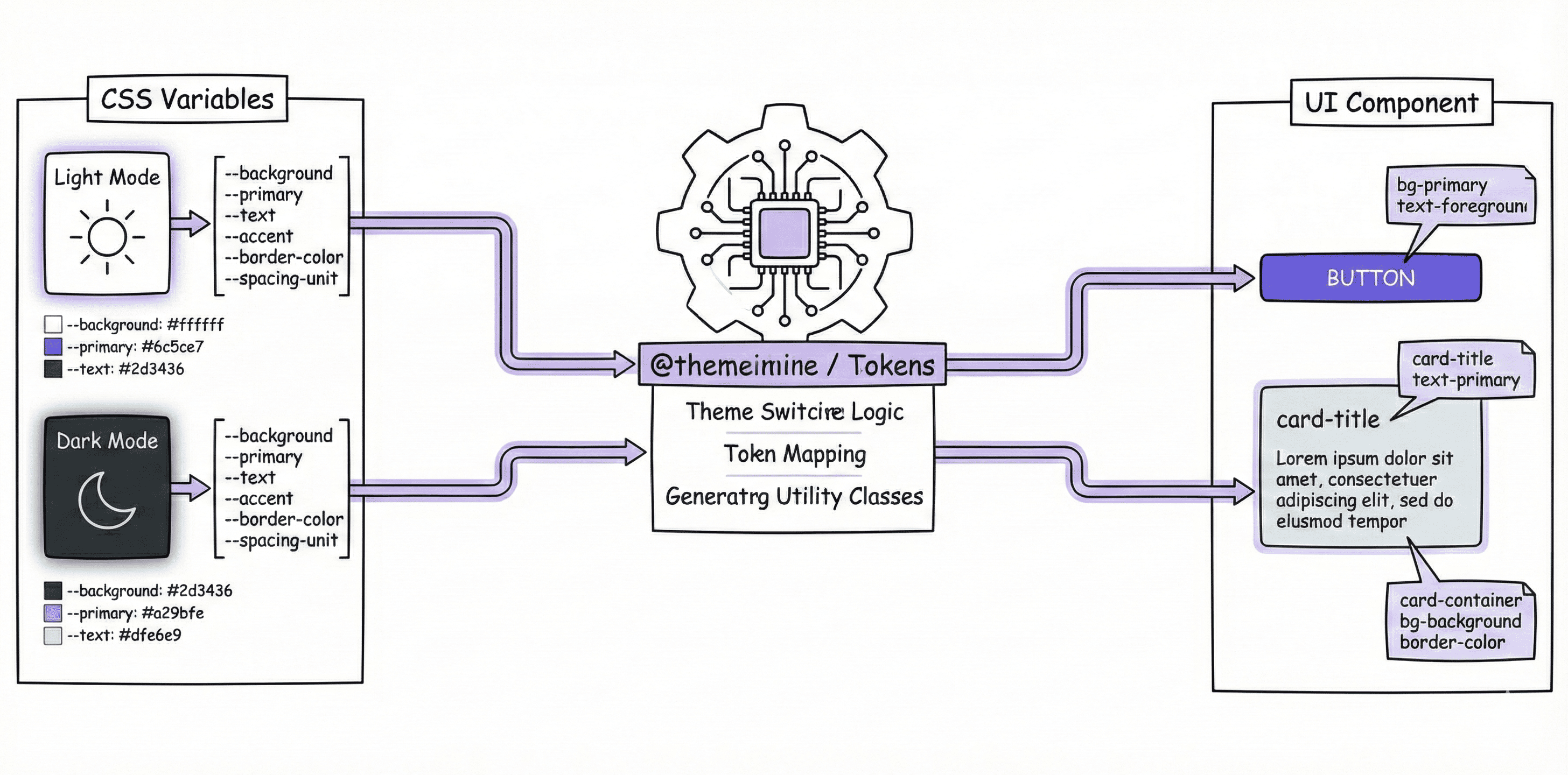
實作亮暗主題 - 方法二:使用語意化顏色(推薦)
這是 shadcn/ui 採用的方法,也是前面「@theme inline:inline 關鍵字的作用」章節介紹的 @theme inline 與 :root/.dark 分工的實際應用。這種方法只需要定義一次樣式,顏色會自動適應主題。
切換機制:CSS 變數的覆蓋原理
這個方法的核心在於 CSS 變數的覆蓋機制:
- 當元素沒有
.dark祖先時,瀏覽器使用:root定義的變數值 - 當元素有
.dark祖先時,.dark定義的變數值會覆蓋:root的值
下圖展示了這個機制的運作流程:

設定方式
/* index.css */
@theme inline {
  --color-background: var(--background);
  --color-foreground: var(--foreground);
}

:root {
  --background: white; /* 亮色模式的背景色 */
  --foreground: black; /* 亮色模式的文字色 */
}

.dark {
  --background: #1a1a1a; /* 暗色模式的背景色 */
  --foreground: white; /* 暗色模式的文字色 */
}
使用方式:
<div className="bg-background text-foreground">
  自動適應亮暗主題,不需要 dark: 前綴
</div>
之所以可以這樣自動切換,關鍵在於:
bg-background最終會被編譯成background-color: var(--background)- 當
<html>沒有.darkclass 時,--background的值是:root定義的white - 當
<html>有.darkclass 時,.dark定義的#1a1a1a會覆蓋:root的值
@theme inline 與 :root/.dark 的分工
在這個設計中,Design Token 的定義分成兩層:
第一層::root 和 .dark 定義原始值
:root {
  --background: white; /* 亮色模式的背景色 */
  --foreground: black; /* 亮色模式的文字色 */
}

.dark {
  --background: #1a1a1a; /* 暗色模式的背景色 */
  --foreground: white; /* 暗色模式的文字色 */
}
這些是 CSS 變數,只能用 var(--background) 的方式在 CSS 中使用,不能直接用於 TailwindCSS class。
第二層:@theme inline 將原始值轉換成 TailwindCSS Token
@theme inline {
  --color-background: var(--background); /* 將 --background 轉換成 TailwindCSS 可用的 Token */
  --color-foreground: var(--foreground);
}
這些是 TailwindCSS Token,可以直接用於 utility class:
// ✅ 可以使用:bg-background 會產生 background-color: var(--background)
<div className="bg-background text-foreground">
// ❌ 雖然技術上可行,但不建議這樣寫
// 因為 TailwindCSS 無法�追蹤這個變數,也無法在 IDE 中提供自動完成
<div className="bg-[var(--background)]">
這種分層設計的好處是:
- 在
:root/.dark中切換主題值(例如暗色模式) - 在
@theme inline中定義 TailwindCSS Token - Token 會自動反映主題值的變化
inline因為使用了 @theme inline,TailwindCSS 會保留 CSS 變數的動態特性,讓 utility class 直接引用 var(--background) 而不是固定的值。這樣當 .dark class 覆蓋 CSS 變數時,utility class 就能自動反映新的值。
在 React 中控制主題
與方法一相同,在 React 中透過切換 <html> 的 .dark class 來控制主題。差別在於這裡不需要為每個樣式寫 dark: 前綴,因為 CSS 變數會根據 .dark 的存在與否自動切換:
import { useState, useEffect } from "react";

export default function App() {
  const [dark, setDark] = useState(false);

  useEffect(() => {
    document.documentElement.classList.toggle("dark", dark);
  }, [dark]);

  return (
    <div className="min-h-screen grid place-items-center">
      <button
        className="px-4 py-2 rounded-md bg-primary text-primary-foreground"
        onClick={() => setDark((d) => !d)}
      >
        切換 {dark ? "Light" : "Dark"}
      </button>
    </div>
  );
}
完整流程:
兩種方法的對比
| 比較項目 | 方法一:dark: 前綴 | 方法二:語意化顏色(推薦) |
|---|---|---|
| 寫法 | 每個樣式寫兩次 | 只寫一次 |
| 維護性 | 較差,修改需改多處 | 較佳,改 CSS 變數即可 |
| 程式碼量 | 較多 | 較少 |
| 用途 | 臨時覆蓋、特殊情況 | 系統性的主題設計 |
| shadcn/ui | ❌ 非主要方式 | ✅ 預設使用 |
// ❌ 方法一:每個顏色都要寫兩次
<div className="bg-white dark:bg-gray-900 text-black dark:text-white border-gray-200 dark:border-gray-700">
  內容
</div>

// ✅ 方法二:語意化顏色,簡潔易維護
<div className="bg-background text-foreground border-border">
  內容
</div>
@layer:組織樣式
@layer 讓你可以控制樣式的優先順序,並且組織自訂的 CSS。
TailwindCSS 的三個層級
TailwindCSS 將 CSS 分成三個層級:
@layer base {
  /* 基礎樣式:重置、預設樣式 */
}

@layer components {
  /* 元件樣式:可重複使用的元件 class */
}

@layer utilities {
  /* 工具樣式:單一用途的 utility class */
}
層級優先順序:
utilities > components > base
實務範例:@layer base 的應用
@layer base {
  * {
    @apply border-border outline-ring/50;
  }
  body {
    @apply bg-background text-foreground;
  }
}
這段程式碼做了什麼?
- 所有元素(*):
- 預設邊框顏色使用
border-border - 預設 outline 顏色使用
outline-ring/50(50% 透明度)
- 預設邊框顏色使用
- body 元素:
- 背景色使用
bg-background - 文字顏色使用
text-foreground
- 背景色使用
@apply 指令:
@apply 讓你可以在 CSS 中使用 TailwindCSS 的 utility classes:
.my-button {
  @apply bg-blue-500 text-white px-4 py-2 rounded hover:bg-blue-600;
}
什麼時候使用 @layer?
三個層級的使用時機可以用「你想要改變什麼?」來判斷:
@layer base:改變 HTML 元素的預設樣式
使用時機: 當你想要改變「所有 <h1>」、「所有 <a>」、「所有 <body>」等 HTML 元素本身 的預設外觀時。
特徵:
- 針對 HTML 標籤(
h1,body,a, 等) - 全域生效,影響整個網站
- 通常在專案初期設定一次就不再修改
範例:
@layer base {
  /* 設定所有 h1 的預設樣式 */
  h1 {
    @apply text-4xl font-bold;
  }

  /* 設定所有連結的預設樣式 */
  a {
    @apply text-blue-500 hover:underline;
  }

  /* 設定所有元素的預設邊框和 outline */
  * {
    @apply border-border outline-ring/50;
  }
}
實際效果: 之後在 HTML 中寫 <h1>標題</h1>,就會自動套用 text-4xl font-bold,不需要額外加 class。
@layer components:建立可重複使用的元件 class
使用時機: 當你有一組樣式需要在多個地方重複使用,並且這組樣式代表一個「元件」(如按鈕、卡片)時。
特徵:
- 針對自訂的 class 名稱(
.btn-primary,.card等) - 需要在 HTML 中手動加上 class 才會生效
- 通常用於建立設計系統中的元件
範例:
@layer components {
  .btn-primary {
    @apply bg-blue-500 text-white px-4 py-2 rounded hover:bg-blue-600;
  }

  .card {
    @apply bg-white rounded-lg shadow-md p-6;
  }
}
使用方式:
<button class="btn-primary">按鈕</button>
<div class="card">卡片內容</div>
在現代的 TailwindCSS 開發中,通常不建議過度使用 @layer components。因為這會失去 Utility-First 的優勢。更好的做法是直接在 React/Vue 元件中組合 utility classes,或使用 CVA(下一篇文章會介紹)。
@layer utilities:建立自訂的 utility class
使用時機: 當 TailwindCSS 內建的 utility class 不夠用,你需要新增一個「單一用途」的工具類別時。
特徵:
- 針對自訂的 utility class(
.text-balance,.scrollbar-hide等) - 每個 class 只做一件事(單一職責)
- 用來擴充 TailwindCSS 的工具類別
範例:
@layer utilities {
  /* 新增文字平衡排版 */
  .text-balance {
    text-wrap: balance;
  }

  /* 新增隱藏捲軸的工具 */
  .scrollbar-hide {
    -ms-overflow-style: none;
    scrollbar-width: none;
  }

  .scrollbar-hide::-webkit-scrollbar {
    display: none;
  }
}
使用方式:
<h1 class="text-balance">這段標題會使用平衡排版</h1>
<div class="overflow-auto scrollbar-hide">捲動區域,�但不顯示捲軸</div>
快速判斷表
| 我想要... | 使用哪個 layer | 範例 |
|---|---|---|
改變所有 <h1> 的預設樣式 | @layer base | h1 { @apply text-4xl; } |
| 建立一個按鈕元件 class | @layer components | .btn { @apply px-4 py-2; } |
| 新增一個工具 class(如隱藏捲軸) | @layer utilities | .scrollbar-hide { ... } |
| 在 React 元件中組合樣式 | 不使用 @layer,直接用 utility classes | <div className="px-4 py-2 bg-blue-500"> |