
This is part 3 of “TailwindCSS Fundamentals Before shadcn/ui.”
The series:
- From MUI to a Utility-First Mindset
- Understanding How TailwindCSS Works
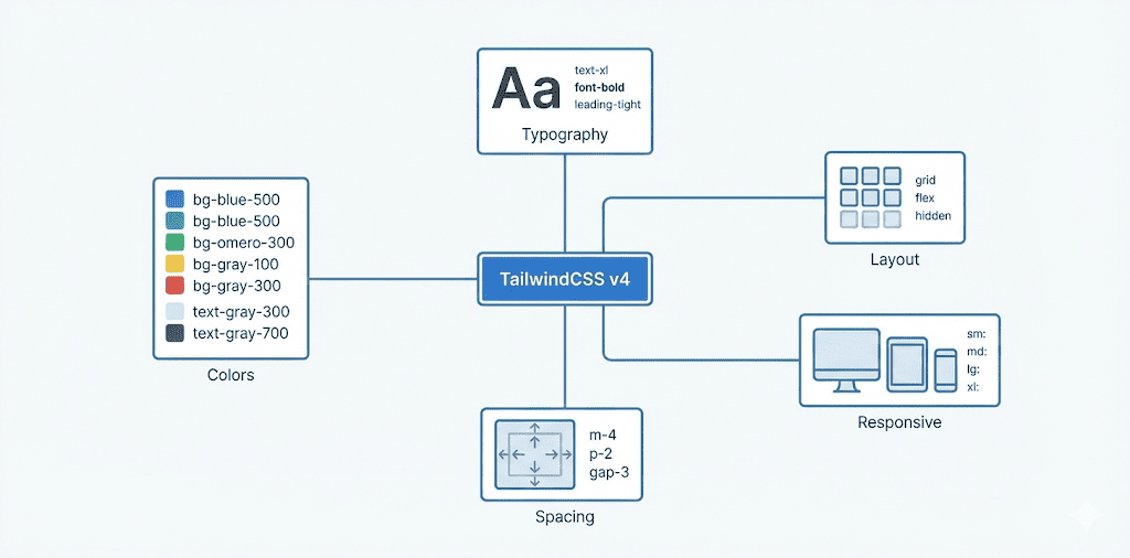
- A Quick Reference to TailwindCSS v4's Built-in Utility Classes (this article)
- Customizing a Design System with @theme
- Understanding shadcn/ui's Design System
- The shadcn/ui Ecosystem and Toolchain
Every utility class in this article is built into TailwindCSS by default. Install TailwindCSS and you can use them straight away, with no extra configuration.
For custom design systems using @theme, including shadcn/ui's semantic colors, see the next article: Customizing a Design System with @theme.
The Color System
TailwindCSS includes a broad color palette, using the pattern {property}-{color}-{shade}.
Color Utility Classes
You can apply the same color to different CSS properties. Here are the most common ones:
| Prefix | CSS property | Example |
|---|---|---|
bg- | background-color | bg-blue-500 |
text- | color | text-blue-500 |
border- | border-color | border-blue-500 |
ring- | box-shadow (ring) | ring-blue-500 |
outline- | outline-color | outline-blue-500 |
shadow- | box-shadow (shadow color) | shadow-blue-500 |
accent- | accent-color (form elements) | accent-blue-500 |
caret- | caret-color (text cursor) | caret-blue-500 |
fill- | fill (SVG fill) | fill-blue-500 |
stroke- | stroke (SVG stroke) | stroke-blue-500 |
from- / to- / via- | Gradient colors | from-blue-500 |
Built-in Color Names
TailwindCSS provides these colors by default:
- Grays:
slate,gray,zinc,neutral,stone - Colors:
red,orange,amber,yellow,lime,green,emerald,teal,cyan,sky,blue,indigo,violet,purple,fuchsia,pink,rose
For the full palette, see the TailwindCSS color documentation.
Shade Levels
Each color has 11 shades:
50  → Lightest (almost white)
100 → Very light
200 → Light
300 → Somewhat light
400 → Medium-light
500 → Standard (base shade)
600 → Medium-dark
700 → Dark
800 → Very dark
900 → Darkest (almost black)
950 → Extra dark (added in v3.2+)
Examples
// Background colors
<div className="bg-blue-500">Blue background</div>
<div className="bg-red-600">Red background (darker)</div>
<div className="bg-green-400">Green background (lighter)</div>

// Text colors
<p className="text-gray-700">Dark gray text</p>
<p className="text-blue-500">Blue text</p>

// Border colors (set a border width first)
<div className="border-2 border-red-500">Red border</div>
Controlling Opacity
TailwindCSS supports two forms of opacity syntax:
// Method 1: / syntax (recommended; affects only this property)
<div className="bg-blue-500/50">Blue background at 50% opacity</div>
<div className="text-gray-900/80">Text at 80% opacity</div>

// Method 2: opacity (affects the entire element, including children)
<div className="bg-blue-500 opacity-50">Entire element at 50% opacity</div>
bg-blue-500/50: only the background color becomes translucent. Text and other content are unaffected.opacity-50: the entire element becomes translucent, including its text, images, and children.
Text and Typography
Font Family
TailwindCSS includes three font stacks:
<p className="font-sans">Sans-serif font (default)</p>
<p className="font-serif">Serif font</p>
<p className="font-mono">Monospace font (for code)</p>
Their corresponding CSS values are:
| Class | CSS font-family |
|---|---|
font-sans | ui-sans-serif, system-ui, sans-serif, ... |
font-serif | ui-serif, Georgia, Cambria, ... |
font-mono | ui-monospace, SFMono-Regular, Menlo, ... |
Font Size
<p className="text-xs">Extra-small text (0.75rem / 12px)</p>
<p className="text-sm">Small text (0.875rem / 14px)</p>
<p className="text-base">Base text (1rem / 16px)</p>
<p className="text-lg">Large text (1.125rem / 18px)</p>
<p className="text-xl">Extra-large text (1.25rem / 20px)</p>
<p className="text-2xl">2xl (1.5rem / 24px)</p>
<p className="text-3xl">3xl (1.875rem / 30px)</p>
<p className="text-4xl">4xl (2.25rem / 36px)</p>
Pattern: text-{size}, where size can be xs, sm, base, lg, xl, 2xl, and so on up to 9xl.
Font Weight
<p className="font-thin">Thin (100)</p>
<p className="font-light">Light (300)</p>
<p className="font-normal">Normal (400)</p>
<p className="font-medium">Medium (500)</p>
<p className="font-semibold">Semibold (600)</p>
<p className="font-bold">Bold (700)</p>
<p className="font-extrabold">Extra bold (800)</p>
<p className="font-black">Black (900)</p>
Line Height
<p className="leading-none">No extra leading (1)</p>
<p className="leading-tight">Tight line height (1.25)</p>
<p className="leading-snug">Snug line height (1.375)</p>
<p className="leading-normal">Normal line height (1.5)</p>
<p className="leading-relaxed">Relaxed line height (1.625)</p>
<p className="leading-loose">Loose line height (2)</p>
Letter Spacing
<p className="tracking-tighter">Tightest letter spacing (-0.05em)</p>
<p className="tracking-tight">Tight letter spacing (-0.025em)</p>
<p className="tracking-normal">Normal letter spacing (0)</p>
<p className="tracking-wide">Wide letter spacing (0.025em)</p>
<p className="tracking-wider">Wider letter spacing (0.05em)</p>
<p className="tracking-widest">Widest letter spacing (0.1em)</p>
Text Alignment and Decoration
// Alignment
<p className="text-left">Left-aligned</p>
<p className="text-center">Centered</p>
<p className="text-right">Right-aligned</p>
<p className="text-justify">Justified</p>

// Decoration
<p className="underline">Underline</p>
<p className="line-through">Strikethrough</p>
<p className="no-underline">Remove underline</p>

// Text case
<p className="uppercase">Uppercase (HELLO)</p>
<p className="lowercase">Lowercase (hello)</p>
<p className="capitalize">Capitalize each word (Hello World)</p>
The Spacing System
This is one of TailwindCSS's most important concepts. The default spacing unit is 0.25rem (4px).
Spacing Values
Value × 0.25rem = actual size

0   → 0
1   → 0.25rem (4px)
2   → 0.5rem  (8px)
3   → 0.75rem (12px)
4   → 1rem    (16px)
6   → 1.5rem  (24px)
8   → 2rem    (32px)
12  → 3rem    (48px)
16  → 4rem    (64px)
Margin
// All four sides
<div className="m-4">1rem margin on all sides</div>

// One side
<div className="mt-4">Top margin</div>
<div className="mr-4">Right margin</div>
<div className="mb-4">Bottom margin</div>
<div className="ml-4">Left margin</div>

// Horizontal/vertical
<div className="mx-4">Horizontal margin (x-axis)</div>
<div className="my-4">Vertical margin (y-axis)</div>

// Automatic centering
<div className="mx-auto">Horizontally centered</div>

// Negative values (extend outward)
<div className="-mt-4">Negative margin (move up by 1rem)</div>
Padding
// All four sides
<div className="p-4">1rem padding on all sides</div>

// One side
<div className="pt-4">Top padding</div>
<div className="pr-4">Right padding</div>
<div className="pb-4">Bottom padding</div>
<div className="pl-4">Left padding</div>

// Horizontal/vertical
<div className="px-4">Horizontal padding</div>
<div className="py-4">Vertical padding</div>
Gap Between Flexbox or Grid Children
// Flexbox example
<div className="flex gap-4">
  <div>Item 1</div>
  <div>Item 2</div>
  <div>Item 3</div>
</div>

// Grid example
<div className="grid grid-cols-3 gap-6">
  <div>Cell 1</div>
  <div>Cell 2</div>
  <div>Cell 3</div>
</div>

// Control horizontal and vertical gaps separately
<div className="grid gap-x-8 gap-y-4">
  {/* Horizontal gap 8 (2rem), vertical gap 4 (1rem) */}
</div>
Layout
Display
<div className="block">Block element</div>
<div className="inline">Inline element</div>
<div className="inline-block">Inline block</div>
<div className="flex">Flexbox container</div>
<div className="inline-flex">Inline flexbox</div>
<div className="grid">Grid container</div>
<div className="hidden">Hidden element (display: none)</div>
Flexbox
// Basic flex container
<div className="flex">
  <div>Item 1</div>
  <div>Item 2</div>
</div>

// Direction
<div className="flex flex-row">Row (default)</div>
<div className="flex flex-col">Column</div>
<div className="flex flex-row-reverse">Reversed row</div>
<div className="flex flex-col-reverse">Reversed column</div>

// Main-axis alignment (justify-content)
<div className="flex justify-start">Start</div>
<div className="flex justify-center">Center</div>
<div className="flex justify-end">End</div>
<div className="flex justify-between">Space between items, with no space at the edges</div>
<div className="flex justify-around">Space around each item</div>
<div className="flex justify-evenly">Evenly spaced</div>

// Cross-axis alignment (align-items)
<div className="flex items-start">Align to top</div>
<div className="flex items-center">Vertically centered</div>
<div className="flex items-end">Align to bottom</div>
<div className="flex items-stretch">Stretch to fill (default)</div>

// Wrapping
<div className="flex flex-wrap">Allow wrapping</div>
<div className="flex flex-nowrap">No wrapping (default)</div>
<div className="flex items-center justify-center">
  {/* Center horizontally and vertically */}
</div>
Grid
// Basic grid
<div className="grid grid-cols-3 gap-4">
  {/*          ^^^^^^^^^^^^ 3 columns   ^^^^^ Gap */}
  <div>1</div>
  <div>2</div>
  <div>3</div>
</div>

// Responsive grid (a common pattern)
<div className="grid grid-cols-1 md:grid-cols-2 lg:grid-cols-3">
  {/*          ^^^^^^^^ 1 column on phones  ^^^^^^ 2 columns on tablets  ^^^^^^ 3 columns on desktop */}
</div>
Sizing
Width
// Fixed width (using spacing values)
<div className="w-64">Width: 16rem (256px)</div>
<div className="w-96">Width: 24rem (384px)</div>

// Percentages
<div className="w-1/2">50% width</div>
<div className="w-1/3">33.333% width</div>
<div className="w-2/3">66.666% width</div>
<div className="w-full">100% width</div>

// Special values
<div className="w-screen">100vw (viewport width)</div>
<div className="w-auto">Automatic width</div>
<div className="w-fit">Fit content width</div>

// Minimum/maximum width
<div className="min-w-0">Minimum width: 0</div>
<div className="max-w-md">Maximum width: 28rem</div>
<div className="max-w-screen-lg">Maximum width: 1024px</div>
Height
// Fixed height
<div className="h-64">Height: 16rem</div>
<div className="h-screen">100vh (viewport height)</div>

// Percentages
<div className="h-full">100% height</div>
<div className="h-1/2">50% height</div>

// Minimum/maximum height
<div className="min-h-screen">Minimum height: 100vh</div>
<div className="max-h-96">Maximum height: 24rem</div>
Size: Set Width and Height Together
// New in v4: size utilities
<div className="size-16">Width and height: 4rem</div>
<div className="size-full">Width and height: 100%</div>

// Practical example: an icon button
<button className="size-9 rounded-md flex items-center justify-center">
  <Icon />
</button>
Borders and Rounded Corners
Borders
// Border width (none by default; set it explicitly)
<div className="border">1px border</div>
<div className="border-2">2px border</div>
<div className="border-4">4px border</div>

// Border on one side
<div className="border-t">Top border</div>
<div className="border-r">Right border</div>
<div className="border-b">Bottom border</div>
<div className="border-l">Left border</div>

// Border colors
<div className="border-2 border-gray-300">Gray border</div>
<div className="border-2 border-blue-500">Blue border</div>

// Border style
<div className="border-2 border-solid">Solid (default)</div>
<div className="border-2 border-dashed">Dashed</div>
<div className="border-2 border-dotted">Dotted</div>
Border Radius
// Border radius
<div className="rounded-none">No rounding</div>
<div className="rounded-sm">Small radius (0.125rem)</div>
<div className="rounded">Default radius (0.25rem)</div>
<div className="rounded-md">Medium radius (0.375rem)</div>
<div className="rounded-lg">Large radius (0.5rem)</div>
<div className="rounded-xl">Extra-large radius (0.75rem)</div>
<div className="rounded-2xl">2xl radius (1rem)</div>
<div className="rounded-full">Fully rounded</div>

// Round one side
<div className="rounded-t-lg">Round the top corners</div>
<div className="rounded-r-lg">Round the right corners</div>
<div className="rounded-b-lg">Round the bottom corners</div>
<div className="rounded-l-lg">Round the left corners</div>

// Round one corner
<div className="rounded-tl-lg">Round the top-left corner</div>
<div className="rounded-tr-lg">Round the top-right corner</div>
<div className="rounded-br-lg">Round the bottom-right corner</div>
<div className="rounded-bl-lg">Round the bottom-left corner</div>
States and Pseudo-classes
TailwindCSS uses the prefix: syntax to handle different states.
Hover
<button className="bg-blue-500 hover:bg-blue-600">
  Turns a darker blue on hover
</button>

<a className="text-blue-500 hover:underline">
  Underlined on hover
</a>

// Multiple hover effects
<button className="bg-white hover:bg-gray-100 hover:shadow-lg transition">
  On hover: gray background and a larger shadow
</button>
Focus
<input
  className="border border-gray-300 focus:border-blue-500 focus:ring-2 focus:ring-blue-200"
  placeholder="Click the input to see the effect"
/>

// Remove the default outline and use a ring instead
<button className="focus:outline-none focus:ring-2 focus:ring-blue-500">
  Custom focus styles
</button>
Active and Disabled
// Active (while pressed)
<button className="bg-blue-500 active:bg-blue-700">
  Turns darker while pressed
</button>

// Disabled
<button
  className="bg-blue-500 disabled:opacity-50 disabled:cursor-not-allowed"
  disabled
>
  Disabled button
</button>
Responsive Design
TailwindCSS takes a mobile-first approach to responsive design.
Breakpoints
(no prefix) All sizes (from 0px)
sm:        640px and up
md:        768px and up
lg:        1024px and up
xl:        1280px and up
2xl:       1536px and up
Classes without a prefix apply at every screen size. Classes with a breakpoint prefix override them at that breakpoint and above.
Responsive Examples
// This means:
<div className="flex flex-col md:flex-row">
  {/* 0-767px: flex-col (column)*/}
  {/* 768px and up: flex-row (row)*/}
</div>

// Different text sizes at different screen sizes
<h1 className="text-2xl md:text-4xl lg:text-6xl">
  {/* 0-767px: text-2xl */}
  {/* 768-1023px: text-4xl */}
  {/* 1024px and up: text-6xl */}
  Responsive heading
</h1>

// Show or hide at different screen sizes
<div className="hidden md:block">
  {/* 0-767px: hidden */}
  {/* 768px and up: visible */}
  Desktop menu
</div>

<div className="block md:hidden">
  {/* 0-767px: visible */}
  {/* 768px and up: hidden */}
  Mobile menu
</div>
A practical example: a responsive grid
<div className="grid grid-cols-1 sm:grid-cols-2 lg:grid-cols-3 xl:grid-cols-4 gap-4">
  {/*
    Phones (0-639px): 1 column
    Small tablets (640-1023px): 2 columns
    Large tablets (1024-1279px): 3 columns
    Desktop (1280px+): 4 columns
  */}
  {items.map((item) => (
    <Card key={item.id} {...item} />
  ))}
</div>
Reference
- Customizing Colors - TailwindCSS
- Background Color - TailwindCSS
- Text Color - TailwindCSS
- Border Color - TailwindCSS
- Font Family - TailwindCSS
- Font Size - TailwindCSS
- Font Weight - TailwindCSS
- Line Height - TailwindCSS
- Letter Spacing - TailwindCSS
- Text Align - TailwindCSS
- Padding - TailwindCSS
- Margin - TailwindCSS
- Gap - TailwindCSS
- Display - TailwindCSS
- Flexbox - TailwindCSS
- Grid Template Columns - TailwindCSS
- Justify Content - TailwindCSS
- Align Items - TailwindCSS
- Width - TailwindCSS
- Height - TailwindCSS
- Border Width - TailwindCSS
- Border Radius - TailwindCSS
- Hover, Focus, and Other States - TailwindCSS
- Responsive Design - TailwindCSS