
This is part 4 of “TailwindCSS Fundamentals Before shadcn/ui.”
The series:
- From MUI to a Utility-First Mindset
- Understanding How TailwindCSS Works
- A Quick Reference to TailwindCSS v4's Built-in Utility Classes
- Customizing a Design System with @theme (this article)
- Understanding shadcn/ui's Design System
- The shadcn/ui Ecosystem and Toolchain
In the previous article, we covered TailwindCSS's built-in utility classes. In a real project, though, you may need to:
- Define brand-specific colors such as
primaryandsecondary - Manage design tokens such as border radii and fonts in one place
- Build a design system that supports themes
That's where @theme comes in.
The Core Idea Behind @theme
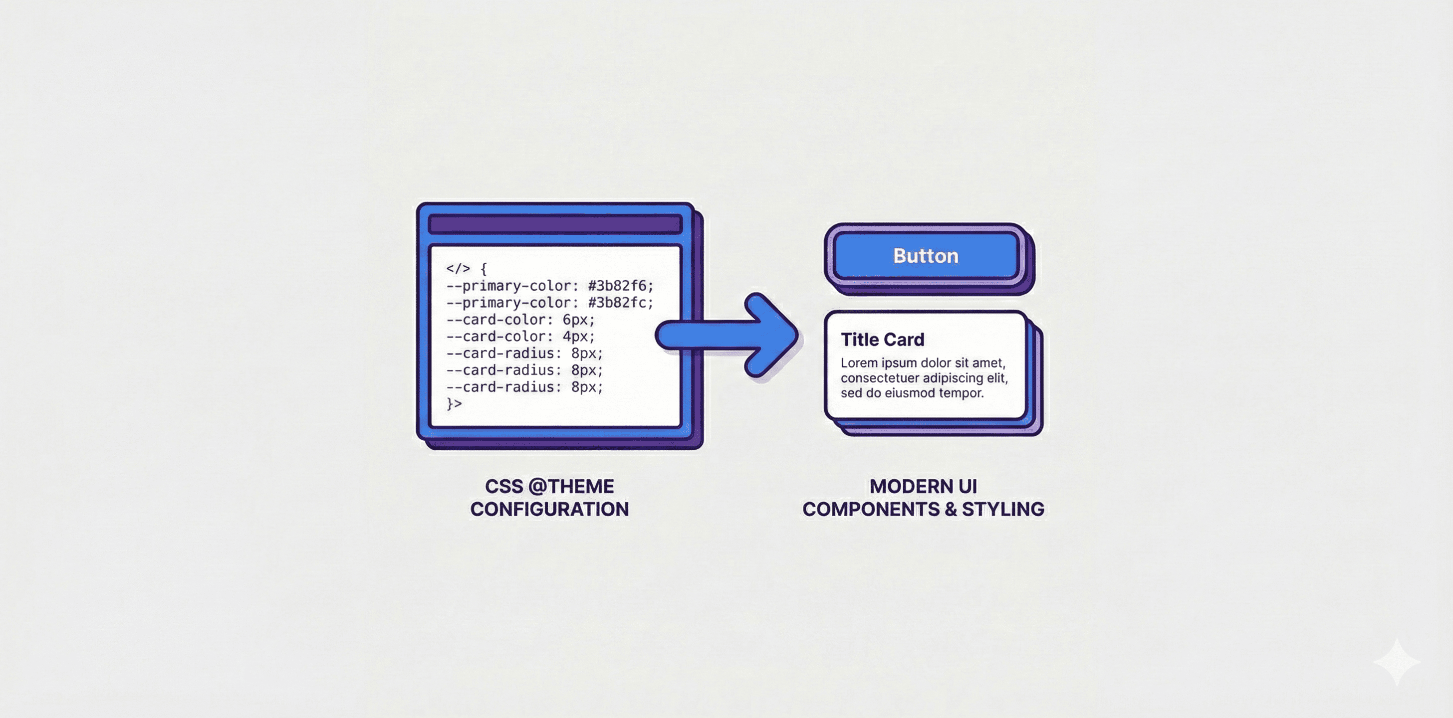
@theme is a new feature in TailwindCSS v4. It lets you define design tokens in CSS, which TailwindCSS then converts into the corresponding utility classes.
Namespace Rules
The key concept is this: TailwindCSS determines which utility classes to generate from the prefix of a CSS variable.
| CSS variable prefix | Generated utility classes | Purpose |
|---|---|---|
--color-* | bg-*, text-*, border-*, ring-*, etc. | Color-related properties |
--spacing-* | p-*, m-*, gap-*, w-*, h-*, etc. | Spacing-related properties |
--radius-* | rounded-* | Border radius |
--font-family-* | font-* | Font family |
--font-size-* | text-* | Font size |
--font-weight-* | font-* | Font weight |
--line-height-* | leading-* | Line height |
--letter-spacing-* | tracking-* | Letter spacing |
--shadow-* | shadow-* | Box shadow |
Conversion Rules
The type prefix is removed during conversion:
--color-primary       → bg-primary, text-primary, border-primary ...
--radius-lg           → rounded-lg
--font-family-heading → font-heading
--spacing-sidebar     → p-sidebar, m-sidebar, w-sidebar ...
Customizing Colors
Basic Usage
/* index.css */
@theme inline {
  /* Define color tokens */
  --color-primary: oklch(0.6171 0.1375 39.0427);
  --color-secondary: oklch(0.9245 0.0138 92.9892);
}
Once defined, you can use them in JSX:
<button className="bg-primary text-white">Primary button</button>
<button className="bg-secondary text-black">Secondary button</button>
<div className="border-2 border-primary">Primary-colored border</div>
Defining --color-primary automatically produces:
bg-primaryfor background colortext-primaryfor text colorborder-primaryfor border colorring-primaryfor ring colorshadow-primaryfor shadow colorfrom-primary,to-primary, andvia-primaryfor gradients- ...and the other utility classes that take colors
shadcn/ui's Color System
shadcn/ui takes this a step further by splitting its CSS variables into two layers:
/* index.css */
@theme inline {
  /* Layer 1: TailwindCSS design tokens (generate utility classes) */
  --color-primary: var(--primary);
  --color-primary-foreground: var(--primary-foreground);
  --color-destructive: var(--destructive);
  --color-destructive-foreground: var(--destructive-foreground);
}

:root {
  /* Layer 2: Actual color values */
  --primary: oklch(0.6171 0.1375 39.0427);
  --primary-foreground: oklch(1 0 0);
  --destructive: oklch(0.5 0.2 30);
  --destructive-foreground: oklch(1 0 0);
}
Why use two layers?
- The variables in
@theme inlinetell TailwindCSS to generate utility classes. - The variables in
:rootstore the actual color values. - You can then override the colors in
.darkwithout redefining@theme.
Usage:
// primary is the background; primary-foreground is the text color on it
<button className="bg-primary text-primary-foreground">
  Primary button
</button>

// destructive is the red used for warnings or deletion
<button className="bg-destructive text-destructive-foreground">
  Delete button
</button>
foreground usually refers to the text color used on a given background.
shadcn/ui provides a pair for each semantic color:
- A main color, such as
primary, for the background - A foreground color, such as
primary-foreground, for text on that background
This keeps enough contrast between the text and its background.
Why Use Semantic Colors?
// ❌ Fixed colors: changing the theme color requires edits in many places
<button className="bg-blue-500 text-white">Button</button>
<div className="border-blue-500">Border</div>
<p className="text-blue-600">Text</p>

// ✅ Semantic colors: change the CSS variables and every usage updates
<button className="bg-primary text-primary-foreground">Button</button>
<div className="border-primary">Border</div>
<p className="text-primary">Text</p>
Customizing Border Radii
Defining Semantic Radii
/* index.css */
@theme inline {
  --radius-sm: calc(var(--radius) - 4px);
  --radius-md: calc(var(--radius) - 2px);
  --radius-lg: var(--radius);
  --radius-xl: calc(var(--radius) + 4px);
}

:root {
  --radius: 0.5rem;
}
Usage:
<div className="rounded-sm">Smaller radius</div>
<div className="rounded-md">Medium radius</div>
<div className="rounded-lg">Standard radius</div>
<div className="rounded-xl">Larger radius</div>
With a value such as calc(var(--radius) - 2px), changing --radius in :root adjusts all of the related radii together.
Customizing Fonts
Defining Custom Fonts
/* index.css */
@theme inline {
  --font-family-sans: "Inter", ui-sans-serif, system-ui, sans-serif;
  --font-family-heading: "Cal Sans", "Inter", sans-serif;
  --font-family-mono: "Fira Code", ui-monospace, monospace;
}
Usage:
<p className="font-sans">Body text uses Inter</p>
<h1 className="font-heading">Headings use Cal Sans</h1>
<code className="font-mono">Code uses Fira Code</code>
Customizing Spacing
Defining Semantic Spacing
/* index.css */
@theme inline {
  --spacing-sidebar: 16rem;
  --spacing-header: 4rem;
  --spacing-content: 2rem;
}
Usage:
<aside className="w-sidebar">Sidebar width: 16rem</aside>
<header className="h-header">Header height: 4rem</header>
<main className="p-content">Content padding: 2rem</main>