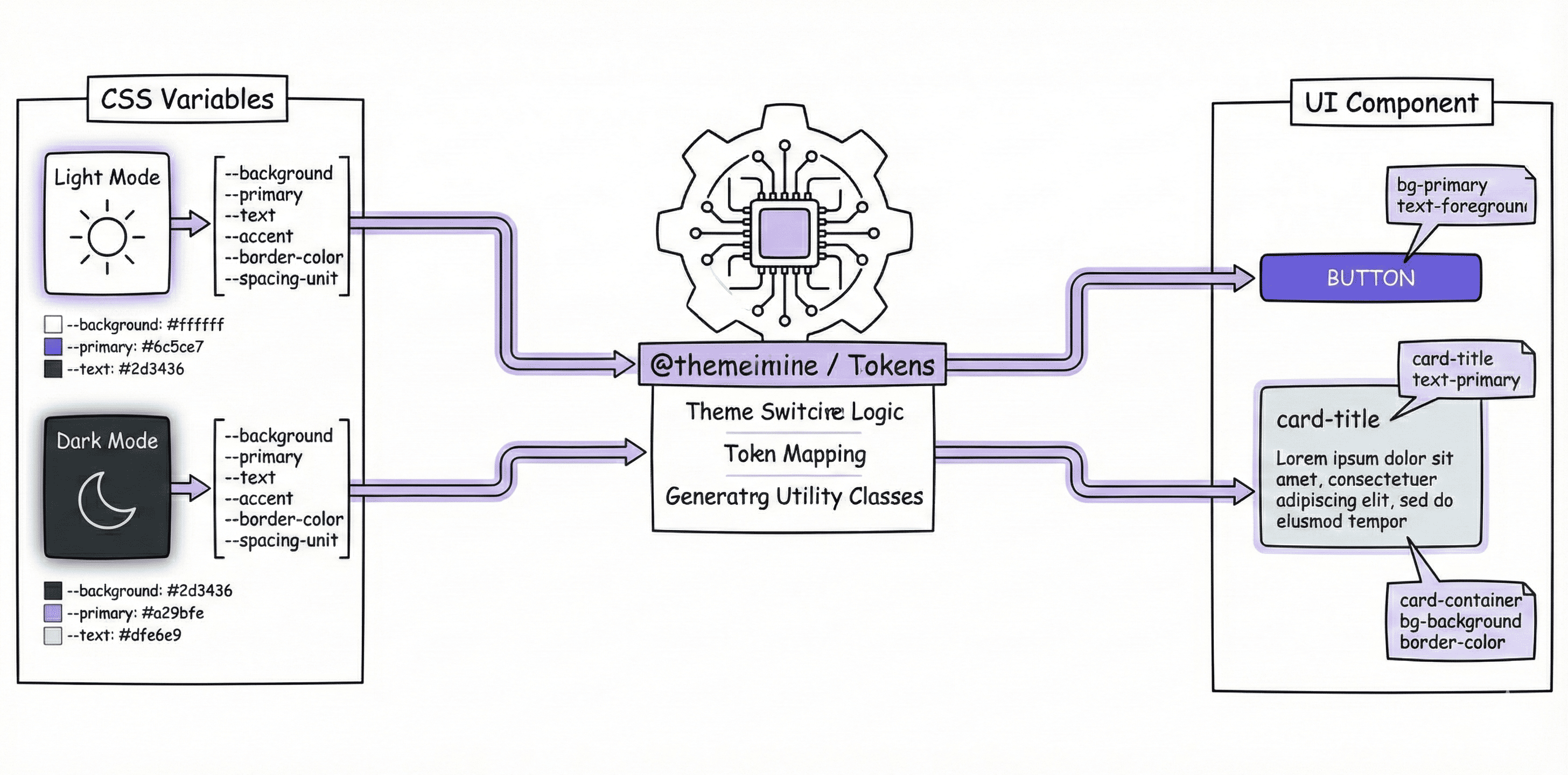

This is part 5 of “TailwindCSS Fundamentals Before shadcn/ui.”
The series:
- From MUI to a Utility-First Mindset
- Understanding How TailwindCSS Works
- A Quick Reference to TailwindCSS v4's Built-in Utility Classes
- Customizing a Design System with @theme
- Understanding shadcn/ui's Design System (this article)
- The shadcn/ui Ecosystem and Toolchain
When you initialize a shadcn/ui project with npx shadcn@latest init, it generates an index.css or globals.css file. At first glance, that file can be a little confusing:
@import "tailwindcss";

@custom-variant dark (&:is(.dark *));

@theme inline {
  --color-background: var(--background);
  --color-primary: var(--primary);
  /* ... More tokens */
}

:root {
  --background: white;
  --primary: oklch(0.6171 0.1375 39.0427);
}

.dark {
  --background: #1a1a1a;
  --primary: oklch(0.8 0.15 250);
}

@layer base {
  body {
    @apply bg-background text-foreground;
  }
}
What exactly are @theme inline, @custom-variant, and @layer? How do :root and .dark make theme switching work?
In this article, we'll walk through shadcn/ui's CSS design system piece by piece to understand what's happening behind each line.
@theme: Defining Design Tokens
What Is a Design Token?
In the index.css or globals.css files in shadcn/ui examples, you'll often see something like this:
@theme inline {
  --color-primary: var(--primary);
  --radius-lg: var(--radius);
}

:root {
  --primary: oklch(0.6171 0.1375 39.0427);
  --radius: 0.5rem;
}

.dark {
  --primary: oklch(0.8 0.15 250);
}
When I first started using shadcn/ui, I could roughly guess that :root and .dark defined theme variables, but I still had a few questions:
- What is
@theme inline? It looks like theme variables too, so how is it different from:root? - How do these variables turn into TailwindCSS utility classes?
These variables are design tokens: a shared set of values for a design system. When designing a site, you'll need to define things like:
- Primary and secondary colors
- Different spacing sizes
- Consistent border radii
- Shadows
You can define all of these as tokens and reuse them throughout the project. @theme is the tool TailwindCSS v4 provides to turn those tokens into utility classes.
Basic @theme Syntax and Usage
Here's an example:
@theme inline {
  --radius-sm: calc(var(--radius) - 4px);
  --radius-md: calc(var(--radius) - 2px);
  --radius-lg: var(--radius);
  --radius-xl: calc(var(--radius) + 4px);

  --color-primary: var(--primary);
  --color-secondary: var(--secondary);
  --color-destructive: var(--destructive);
}

:root {
  --radius: 0.5rem;
  --primary: oklch(0.6171 0.1375 39.0427);
  --secondary: oklch(0.9245 0.0138 92.9892);
}
What does it do?
How Tokens Become Utility Classes
In the example above, defining --color-primary lets us use bg-primary in React or HTML. There's a specific naming convention behind that conversion.
For details on each token type, see the TailwindCSS v4 theme documentation and part 4 of this series: Customizing a Design System with @theme.
Rule 1: Remove the type prefix
When a token becomes a utility class, its type prefix—such as --color-, --spacing-, or --radius-—is removed, leaving its semantic name.
Rule 2: Combine it with a property prefix
Different CSS properties have different TailwindCSS prefixes:
| Token type | Definition | Usage |
|---|---|---|
| Color | --color-brand | bg-brand, text-brand, border-brand |
| Spacing | --spacing-lg | p-lg, m-lg, gap-lg |
| Border radius | --radius-card | rounded-card |
| Width | --width-sidebar | w-sidebar, min-w-sidebar |
| Height | --height-header | h-header, max-h-header |
| Font family | --font-family-heading | font-heading |
| Font size | --font-size-xl | text-xl |
| Font weight | --font-weight-bold | font-bold |
| Shadow | --shadow-card | shadow-card |
| Opacity | --opacity-soft | opacity-soft |
An example in practice:
/* Define in index.css */
@theme inline {
  --color-brand: #ff6b6b;
  --spacing-card: 1.5rem;
  --radius-button: 0.375rem;
  --font-family-heading: "Inter", sans-serif;
  --font-size-xl: 1.25rem;
  --shadow-elevated: 0 4px 6px rgba(0, 0, 0, 0.1);
  --width-sidebar: 16rem;
}
// Use in React/HTML
function Card() {
  return (
    <div
      className="
      bg-brand              {/* --color-brand */}
      p-card                {/* --spacing-card */}
      rounded-button        {/* --radius-button */}
      shadow-elevated       {/* --shadow-elevated */}
      w-sidebar             {/* --width-sidebar */}
    "
    >
      <h1 className="font-heading text-xl">
        {" "}
        {/* --font-family-heading, --font-size-xl */}
        Heading
      </h1>
    </div>
  );
}
Border radii have a particular naming detail: the token uses --radius-, but the utility class uses rounded-:
--radius-lg→rounded-lg:radiusin the token,roundedin the utility.--radius-button→rounded-button
Compare that with a color token:
--color-primary→bg-primary: both concern color.
@theme inline: What inline Does
The examples so far have used @theme inline rather than plain @theme. The difference is whether the dynamic behavior of CSS variables is preserved. That matters directly for features such as dark mode, as we'll see later in “Method 2: Semantic Colors.”
inline Keeps Values Dynamic
The inline keyword tells Tailwind that these theme values are dynamic: they should be resolved by the browser at runtime through references to other CSS variables, rather than fixed at build time.
Let's look at an example.
Without inline:
/* Definition */
@theme {
  --color-primary: var(--primary);
}

:root {
  --primary: oklch(0.6171 0.1375 39.0427);
}

.dark {
  --primary: oklch(0.8 0.15 250);
}
TailwindCSS generates:
:root {
  --color-primary: var(--primary); /* Generated global variable */
}

.bg-primary {
  background-color: var(
    --color-primary
  ); /* The utility uses --color-primary defined above */
}
The problem is that --color-primary is resolved at the :root level. If a nested .dark selector changes --primary—we'll cover how .dark works shortly—--color-primary may not pick up that change, leaving bg-primary with the old value.
With inline:
/* Definition */
@theme inline {
  --color-primary: var(--primary);
}

:root {
  --primary: oklch(0.6171 0.1375 39.0427);
}

.dark {
  --primary: oklch(0.8 0.15 250);
}
TailwindCSS skips the intermediate --color-primary variable and makes the utility class reference your semantic variable directly:
.bg-primary {
  background-color: var(
    --primary
  ); /* Reference --primary directly, without an intermediate --color-primary */
}
Now, wherever --primary changes—inside .dark, [data-theme="..."], or even a particular component container—bg-primary reflects the current color correctly.
Light and Dark Themes, Method 1: The dark: Prefix
With @theme inline covered, let's look at a complete light and dark theme switch.
There are two main approaches in TailwindCSS:
- Use the
dark:prefix: specify each style twice. - Use semantic colors: colors adapt automatically; this is the recommended approach.
We'll start with method 1, where you explicitly specify both the light and dark versions of each style.
Usage:
<div class="bg-white dark:bg-gray-800 text-gray-900 dark:text-white">
  Specify each style twice
</div>
The key is the dark: prefix, called a variant. It works like a condition: apply the following style only when the dark condition is met.
hover:applies while the pointer is hovering over the element.focus:applies when the element has focus.dark:applies under the.darktheme.
So what exactly is this
darkcondition? That's something we need to define.
Define the dark: Variant with @custom-variant
Tailwind v4 provides @custom-variant for defining your own variants. Add this line to your CSS to define dark::
@custom-variant dark (&:is(.dark *)); /* shadcn default definition */
Let's break it into three parts:
@custom-varianttells Tailwind we're defining a new variant.darkis its name. Naming itdarklets us usedark:. If we called itnight-mode, we'd writenight-mode:bg-primaryinstead.(&:is(.dark *))is the condition, expressed as a CSS selector. In plain English: this element (&) must be inside an ancestor with the.darkclass.
How It Compiles
When you write dark:bg-foreground dark:text-background, the compilation works like this:
1. Tailwind compiles the base utility classes
For bg-background text-foreground, Tailwind generates the basic utility classes based on your @theme configuration:
.bg-background {
  background-color: var(--color-background);
}
.text-foreground {
  color: var(--color-foreground);
}
2. Tailwind compiles the dark: variant
For dark:bg-foreground dark:text-background, Tailwind looks up the variant named dark. It finds the (&:is(.dark *)) rule defined with @custom-variant and combines that rule with the utility class to generate a conditional class:
/* Expanded dark variant: equivalent to a .dark ancestor selector */
.dark .dark\:bg-foreground {
  background-color: var(--color-foreground);
}
.dark .dark\:text-background {
  color: var(--color-background);
}
The selector .dark .dark\:bg-foreground means the style applies only when an element has the dark:bg-foreground class and is a descendant of an element with .dark.
&:is(.dark *) lets .dark take effect at any ancestor level, rather than only on the immediate parent. Whether .dark is on <html> or <body>, deeply nested children can receive the dark styles.
Controlling Light and Dark Themes in React
For dark: styles to apply, the element must be a descendant of .dark. The usual approach is to toggle .dark on the <html> element. Everything on the page then becomes its descendant, so all dark: styles take effect together:
import { useState, useEffect } from "react";

export default function App() {
  const [dark, setDark] = useState(false);

  useEffect(() => {
    // Toggle the .dark class on <html>
    // Enable or disable all dark: styles together
    document.documentElement.classList.toggle("dark", dark);
  }, [dark]);

  return (
    <div className="min-h-screen grid place-items-center">
      <button
        className="px-4 py-2 rounded-md bg-white dark:bg-gray-800 text-gray-900 dark:text-white"
        onClick={() => setDark((d) => !d)}
      >
        Switch to {dark ? "Light" : "Dark"}
      </button>
    </div>
  );
}
The complete flow:
Light and Dark Themes, Method 2: Semantic Colors (Recommended)
This is the approach shadcn/ui uses. It puts the division of responsibilities between @theme inline and :root/.dark into practice. Define each style once, and its colors adapt to the theme.
How Switching Works: Overriding CSS Variables
The core mechanism is overriding CSS variables:
- When an element has no
.darkancestor, the browser uses the values defined in:root. - When it has a
.darkancestor, the values defined in.darkoverride those from:root.
This diagram shows how that works:

Configuration
/* index.css */
@theme inline {
  --color-background: var(--background);
  --color-foreground: var(--foreground);
}

:root {
  --background: white; /* Light-mode background color */
  --foreground: black; /* Light-mode text color */
}

.dark {
  --background: #1a1a1a; /* Dark-mode background color */
  --foreground: white; /* Dark-mode text color */
}
Usage:
<div className="bg-background text-foreground">
  Adapts to light and dark themes without a dark: prefix
</div>
The automatic switch comes down to three things:
bg-backgroundcompiles tobackground-color: var(--background).- Without
.darkon<html>,--backgrounduses thewhitevalue defined in:root. - With
.darkon<html>, the#1a1a1avalue in.darkoverrides the value from:root.
The Roles of @theme inline and :root/.dark
In this design, tokens are defined in two layers.
Layer 1: :root and .dark define the underlying values
:root {
  --background: white; /* Light-mode background color */
  --foreground: black; /* Light-mode text color */
}

.dark {
  --background: #1a1a1a; /* Dark-mode background color */
  --foreground: white; /* Dark-mode text color */
}
These are CSS variables, used in CSS through expressions such as var(--background). They can't be used directly as TailwindCSS classes.
Layer 2: @theme inline maps those values to TailwindCSS tokens
@theme inline {
  --color-background: var(--background); /* Map --background to a token TailwindCSS can use */
  --color-foreground: var(--foreground);
}
These are TailwindCSS tokens, available through utility classes:
// ✅ Use this: bg-background generates background-color: var(--background)
<div className="bg-background text-foreground">

// ❌ Technically possible, but not recommended
// TailwindCSS cannot track this variable or provide IDE autocomplete for it
<div className="bg-[var(--background)]">
This separation lets you:
- Switch theme values in
:rootand.dark, for example for dark mode. - Define TailwindCSS tokens in
@theme inline. - Have the tokens reflect theme value changes automatically.
With @theme inline, TailwindCSS preserves the dynamic behavior of CSS variables. Utilities reference var(--background) directly instead of a fixed value, so when .dark overrides the variable, the utilities pick up the new value.
Controlling the Theme in React
As with method 1, you control the theme by toggling .dark on <html>. The difference is that you don't need a dark: prefix for every style. The CSS variables switch automatically based on whether .dark is present:
import { useState, useEffect } from "react";

export default function App() {
  const [dark, setDark] = useState(false);

  useEffect(() => {
    document.documentElement.classList.toggle("dark", dark);
  }, [dark]);

  return (
    <div className="min-h-screen grid place-items-center">
      <button
        className="px-4 py-2 rounded-md bg-primary text-primary-foreground"
        onClick={() => setDark((d) => !d)}
      >
        Switch to {dark ? "Light" : "Dark"}
      </button>
    </div>
  );
}
The complete flow:
Comparing the Two Approaches
Method 1: dark: Prefix | Method 2: Semantic Colors (Recommended) | |
|---|---|---|
| Syntax | Specify each style twice | Specify each style once |
| Maintenance | Changes require edits in multiple places | Change the CSS variables |
| Code volume | More | Less |
| Use case | One-off overrides and special cases | A consistent theme system |
| shadcn/ui | ❌ Not its main approach | ✅ Used by default |
// ❌ Method 1: specify every color twice
<div className="bg-white dark:bg-gray-900 text-black dark:text-white border-gray-200 dark:border-gray-700">
  Content
</div>

// ✅ Method 2: semantic colors keep things concise and maintainable
<div className="bg-background text-foreground border-border">
  Content
</div>
@layer: Organizing Styles
@layer lets you organize custom CSS and control style precedence.
TailwindCSS's Three Layers
TailwindCSS divides CSS into three layers:
@layer base {
  /* Base styles: resets and defaults */
}

@layer components {
  /* Component styles: reusable component classes */
}

@layer utilities {
  /* Utility styles: single-purpose utility classes */
}
Layer precedence:
utilities > components > base
A Practical Example: @layer base
@layer base {
  * {
    @apply border-border outline-ring/50;
  }
  body {
    @apply bg-background text-foreground;
  }
}
What does this do?
- For all elements (
*):- Use
border-borderas the default border color. - Use
outline-ring/50as the default outline color, at 50% opacity.
- Use
- For the body:
- Use
bg-backgroundfor the background. - Use
text-foregroundfor text.
- Use
The @apply directive:
@apply lets you use TailwindCSS utilities inside CSS:
.my-button {
  @apply bg-blue-500 text-white px-4 py-2 rounded hover:bg-blue-600;
}
When Should You Use @layer?
Choose a layer based on what you're trying to change.
@layer base: Change the Default Styles of HTML Elements
Use it when you want to change the default appearance of HTML elements themselves, such as every <h1>, <a>, or <body>.
Characteristics:
- Targets HTML tags such as
h1,body, anda - Applies globally across the site
- Usually configured near the start of a project and rarely changed afterward
Example:
@layer base {
  /* Set the default styles for all h1 elements */
  h1 {
    @apply text-4xl font-bold;
  }

  /* Set the default styles for all links */
  a {
    @apply text-blue-500 hover:underline;
  }

  /* Set default border and outline styles for all elements */
  * {
    @apply border-border outline-ring/50;
  }
}
The result: writing <h1>Title</h1> in HTML automatically applies text-4xl font-bold, with no extra classes required.
@layer components: Create Reusable Component Classes
Use it when you have a group of styles reused in several places that represents a component, such as a button or card.
Characteristics:
- Targets custom class names such as
.btn-primaryand.card - Applies only when you add the class in HTML
- Often used for components in a design system
Example:
@layer components {
  .btn-primary {
    @apply bg-blue-500 text-white px-4 py-2 rounded hover:bg-blue-600;
  }

  .card {
    @apply bg-white rounded-lg shadow-md p-6;
  }
}
Usage:
<button class="btn-primary">Button</button>
<div class="card">Card content</div>
In modern TailwindCSS projects, overusing @layer components is generally discouraged, because it loses the benefits of utility-first styling. A better approach is to compose utilities directly in React or Vue components, or use CVA, which we'll cover in the next article.
@layer utilities: Create Custom Utility Classes
Use it when the built-in utilities don't cover what you need and you want to add a class with a single purpose.
Characteristics:
- Targets custom utilities such as
.text-balanceand.scrollbar-hide - Each class does one thing
- Extends TailwindCSS's utility classes
Example:
@layer utilities {
  /* Add balanced text wrapping */
  .text-balance {
    text-wrap: balance;
  }

  /* Add a utility to hide scrollbars */
  .scrollbar-hide {
    -ms-overflow-style: none;
    scrollbar-width: none;
  }

  .scrollbar-hide::-webkit-scrollbar {
    display: none;
  }
}
Usage:
<h1 class="text-balance">This heading uses balanced text wrapping</h1>
<div class="overflow-auto scrollbar-hide">Scrollable area with hidden scrollbars</div>
A Quick Decision Table
| I want to... | Layer | Example |
|---|---|---|
Change the default style of every <h1> | @layer base | h1 { @apply text-4xl; } |
| Create a button component class | @layer components | .btn { @apply px-4 py-2; } |
| Add a utility, such as hiding the scrollbar | @layer utilities | .scrollbar-hide { ... } |
| Compose styles in a React component | Use utility classes directly, without @layer | <div className="px-4 py-2 bg-blue-500"> |